BarGroup (Component)
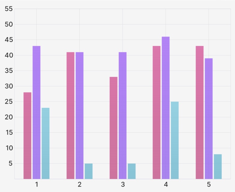
The BarGroup component takes a ChartBounds object, some options for spacing, and some BarGroup.Bar children and returns an array of Skia Path elements to draw the grouped bar chart.

Example
import { CartesianChart, BarGroup } from "victory-native";
import DATA from "./my-data";

export function MyChart() {
  return (
    <CartesianChart data={DATA} xKey="x" yKeys={["y", "z"]}>
      {({ points, chartBounds }) => (
        <BarGroup
          chartBounds={chartBounds}
          betweenGroupPadding={0.3}
          withinGroupPadding={0.1}
        >
          <BarGroup.Bar points={points.y} color="red" />
          <BarGroup.Bar points={points.z} color="blue" />
        </BarGroup>
      )}
    </CartesianChart>
  );
}
Props
chartBounds
A ChartBounds object needed to appropriately draw the bars. This generally comes from the chartBounds render argument of CartesianChart.
betweenGroupPadding
An optional number between 0 and 1 that represents what fraction of the horizontal space between the first and last bar groups should be "white space". Defaults to 0.2. Use 0 for no gap between groups, and values closer to 1 to make bars increasingly narrow.
withinGroupPadding
An optional number between 0 and 1 that represents what fraction of the horizontal space between the first and last bars within a group should be "white space". Defaults to 0.2. Use 0 for no gap between bars within a group, and values closer to 1 to make bars increasingly narrow.
onBarSizeChange
An optional callback of the form:
onBarSizeChange: (values: {
  barWidth: number;
  groupWidth: number;
  gapWidth: number;
}) => void;
That alerts the consumer when the size of the bars/groups changes, useful for if you're building a custom tooltip and need to know the size of the groups/bars.
roundedCorners
The roundedCorners prop allows you to customize the roundedness of each corner of a BarGroup.Bar component. It's an object type that defines the radii for the top-left, top-right, bottom-right, and bottom-left corners.
topLeft?: number: Defines the radius of the top-left corner of the Bar. If not provided, the default is 0 (no rounding).topRight?: number: Defines the radius of the top-right corner of the Bar. If not provided, the default is 0 (no rounding).bottomRight?: number: Defines the radius of the bottom-right corner of the Bar. If not provided, the default is 0 (no rounding).bottomLeft?: number: Defines the radius of the bottom-left corner of the Bar. If not provided, the default is 0 (no rounding).
children
An array of BarGroup.Bar elements (see below) that represent the bars to add to the bar group.
BarGroup.Bar Props
points
A PointsArray array indicating the dataset to be used for this particular bar. Generally comes from the points value of the CartesianChart render function argument.
animate
The animate prop takes a PathAnimationConfig object and will animate the path when the points changes.
children
A children pass-thru that will be rendered inside of the Skia Path element, useful if you'd like to make e.g. a gradient path.
Paint properties
The Line component will also pass the following painting props down to the underlying Path component:
colorblendModeopacityantiAlias